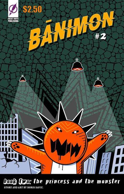
Banimon is a three issue comic from Rocket North Publishing that I ran across at last year’s New York Comic Con, and after a quick flip through, I purchased all three issues from the creators. It’s a beautiful little publication, and the look of it grabbed me right off the bat. I bought it, I brought it home, it went in the stack of things to be read.
And just a little while ago, dug it out of that stack and started devouring it in earnest… And was a bit disappointed. As art, as graphic design, as a study in character design and color process in printing, as AN OBJECT, it’s phenomenal. But as a comic? Not so much. It reads as a series of unconnected nice pieces that don’t fit together to make much of anything. The flow of storytelling is rough and choppy, and the typesetting and layout of panels on the page ends up being kinda cluttered and off-putting. (The story itself is nothing earth-shattering, but that’s perfectly fine. I’ve no problem with the central ideas, the problem here arises in the undue confusion and the muddled expression of those concepts.)
And given that it’s a product produced by a design studio (the Banimon website doesn’t mention the creator’s name anywhere), I guess that’s the thing. It’s not really a comic book. It’s a character line in search of a purpose, it’s a good marketing tool, a design project, a pretty great portfolio, and if it was just that instead of a ham-fisted attempt at plot and storytelling, I think it’d be fine.
So then. A nice art item. Not a comic. There’s more than enough eye candy contained within to make me happy to own it, and for me remember Rocket North’s name if I see more of their work. So… That’s okay.

